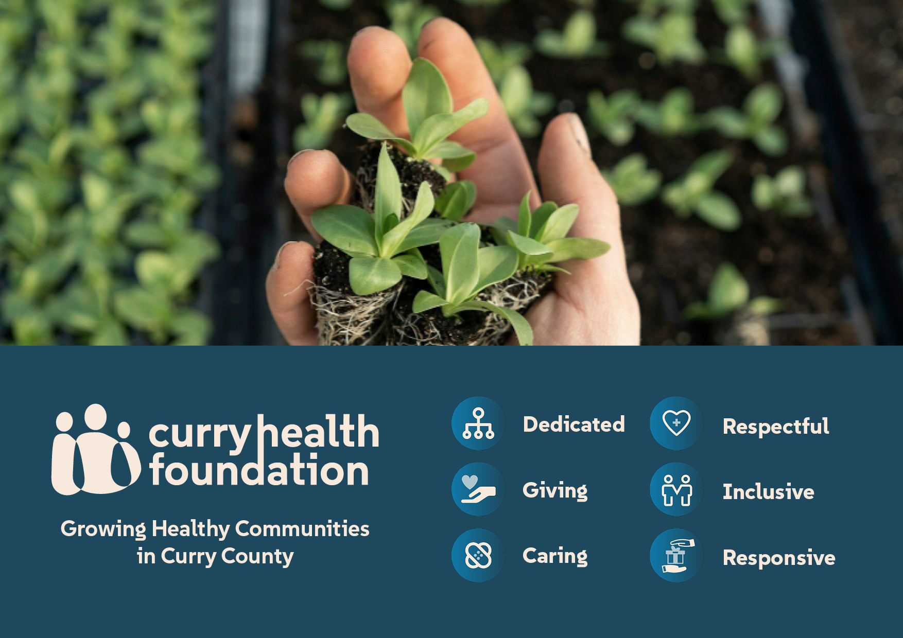
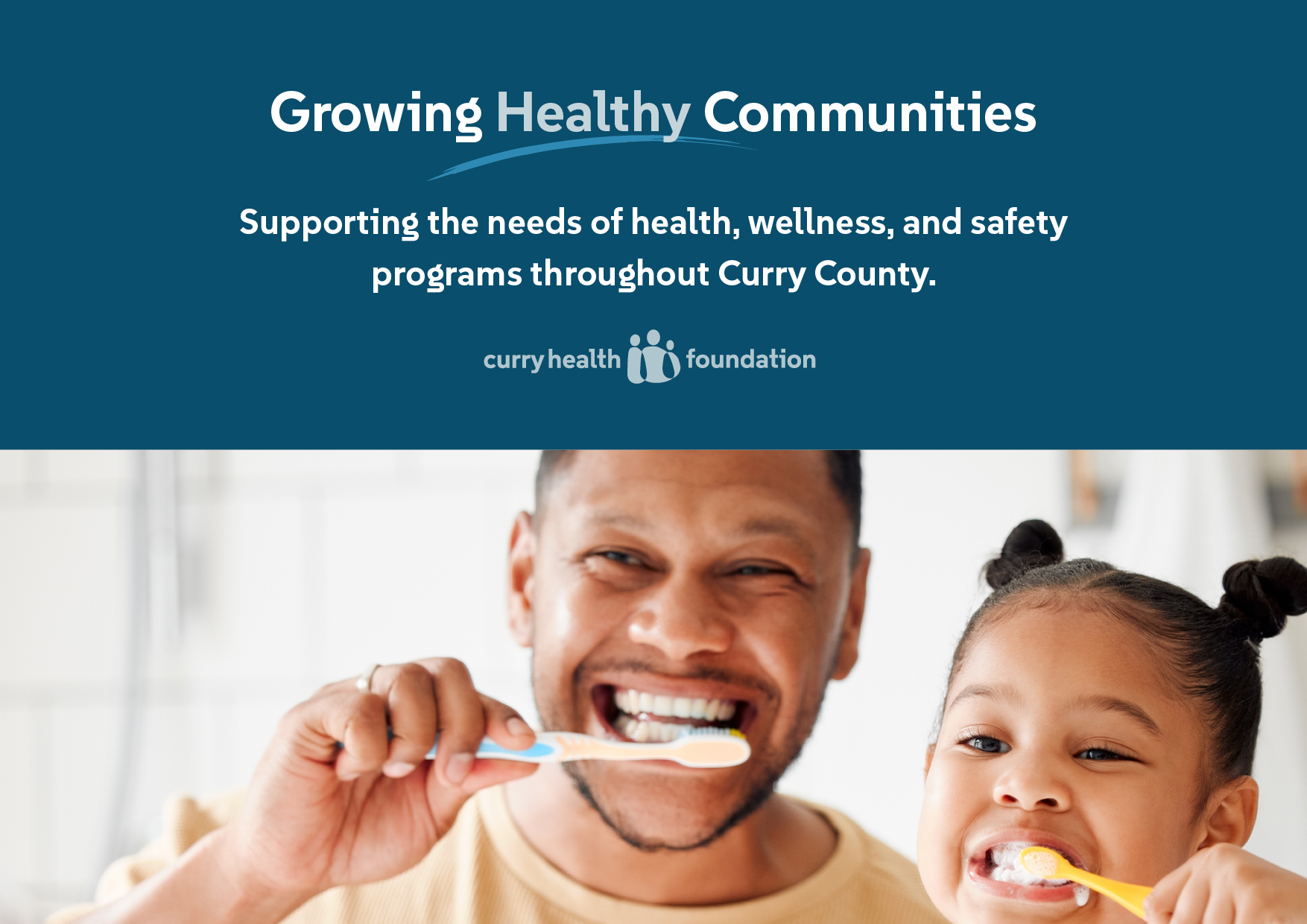
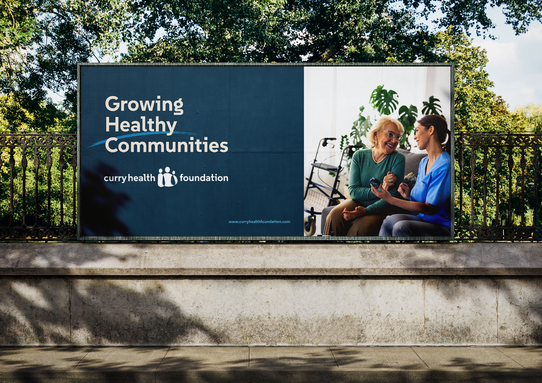
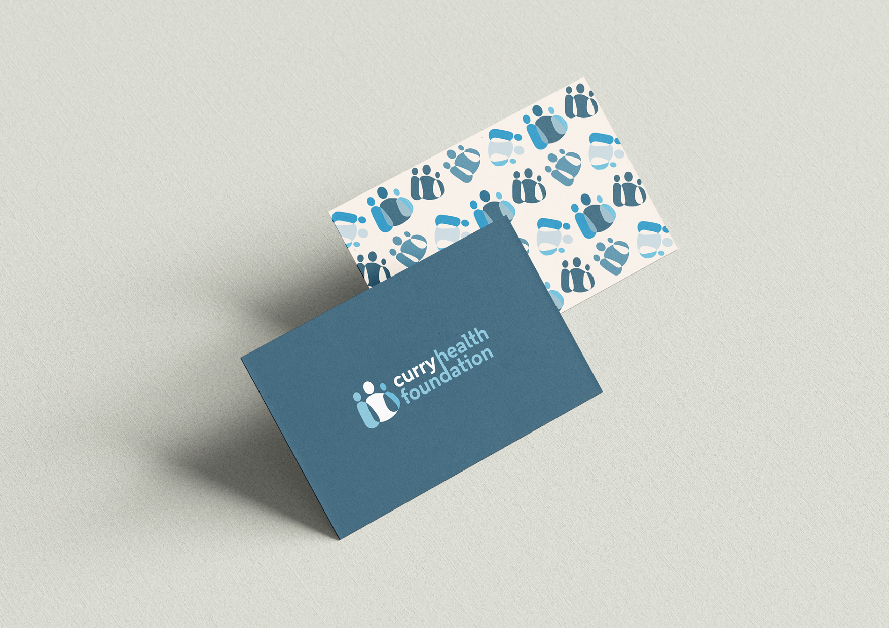
A well-established and essential non-profit foundation located in a small rural community is pursuing a rebranding initiative to enhance its differentiation in the healthcare industry and to effectively convey the full scope of its services. The objective is to develop a visual identity that aligns with this strategic outcome. This 501(c)(3) organization provides grant funding to other health-related non-profits, enabling them to deliver essential services and programs through the provision of supplies and equipment. Consequently, this foundation plays a significant role in addressing the health needs of residents in Curry County. Their brand embodies the values of strength, unity, community, and vitality, all of which are integral to their mission of promoting healthy living.
BRAND IDENTITY DESIGN | WEBSITE DESIGN
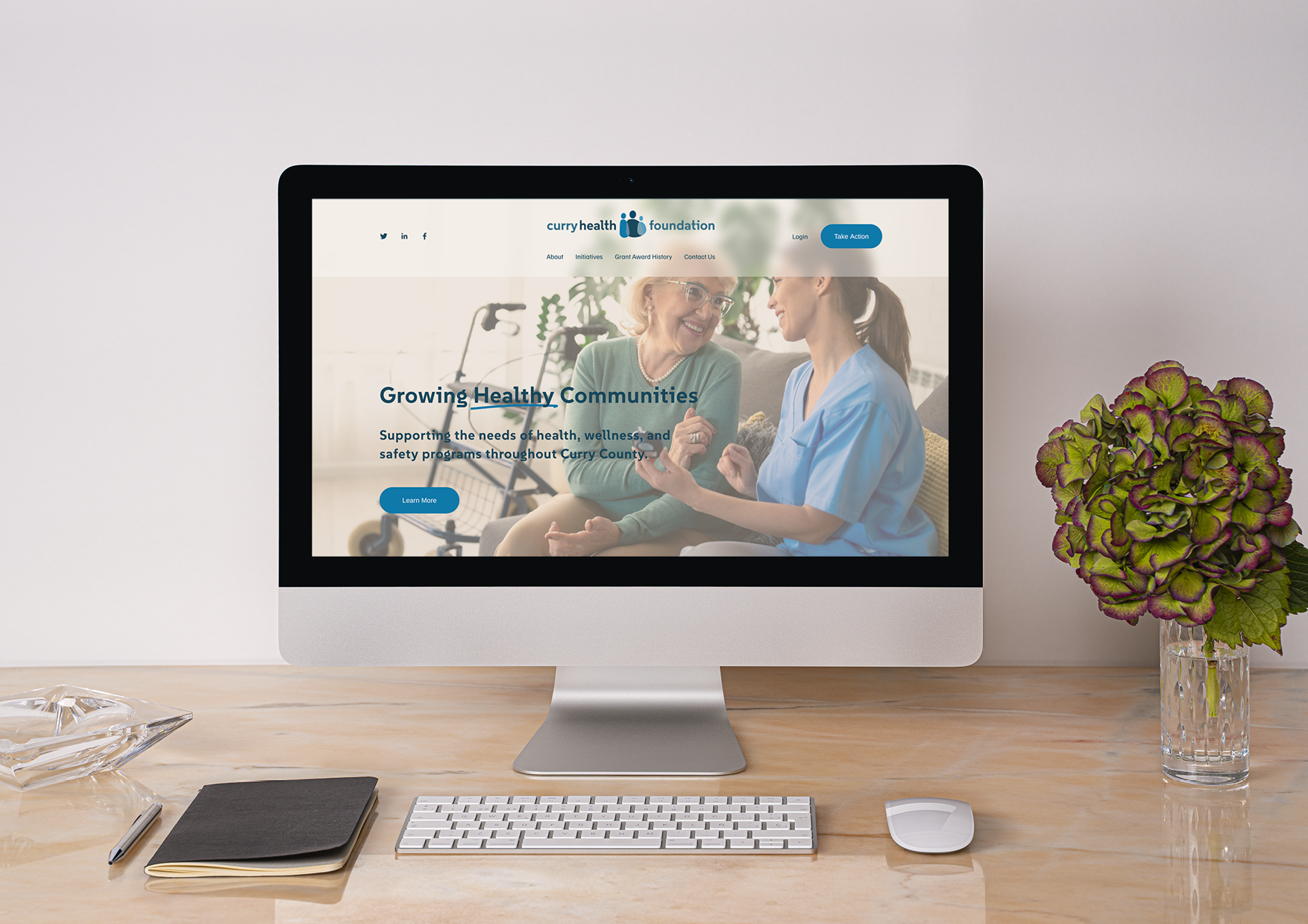

Organization and clarity in messaging are fundamental for this Foundation as it showcases key features to potential donors, sponsors, volunteers, board members, and grantees. A professional and modern aesthetic is essential to effectively highlight the Foundation's invaluable contributions to the Curry County community. The design must streamline the user experience, guiding visitors directly to the information they seek.
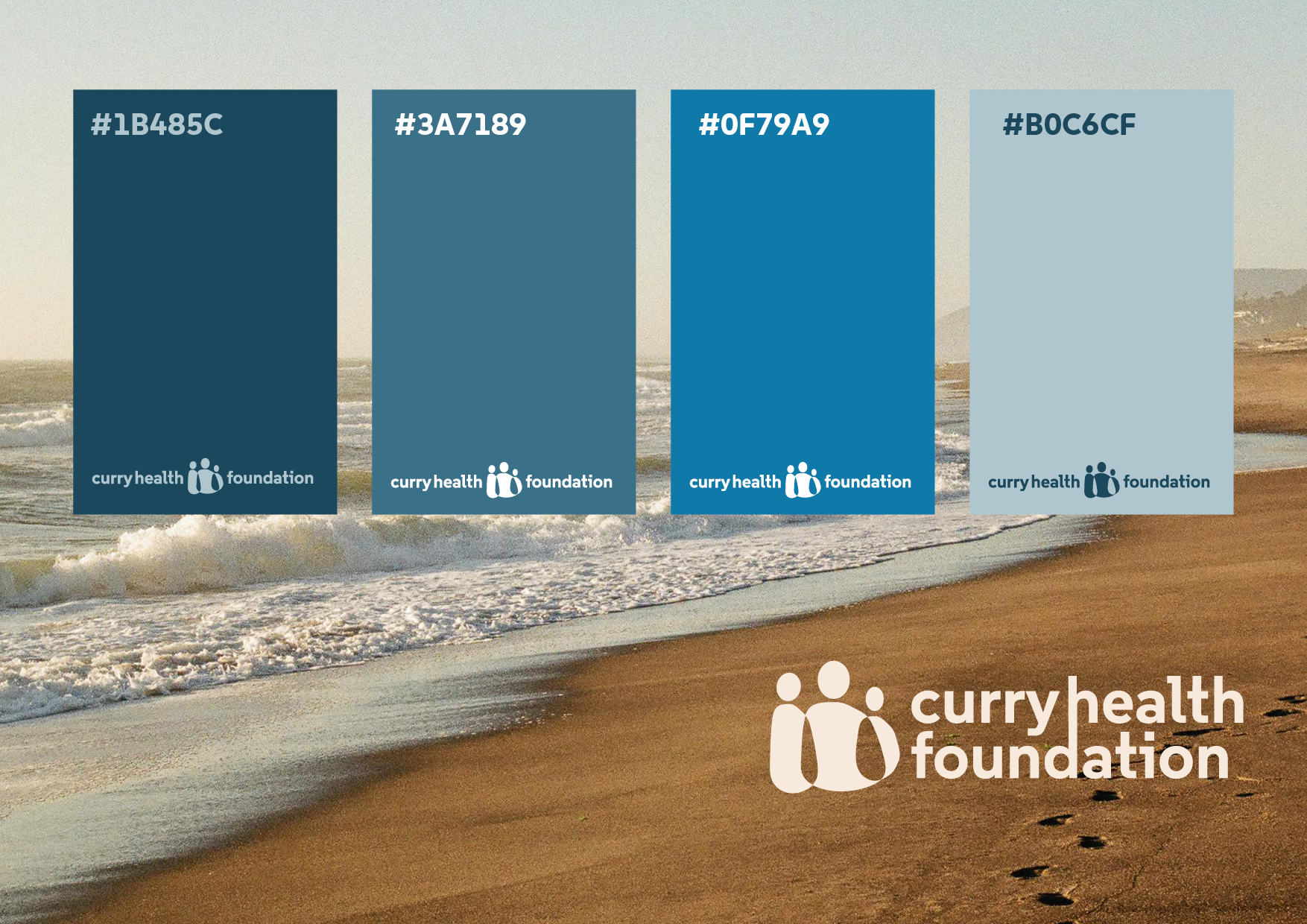
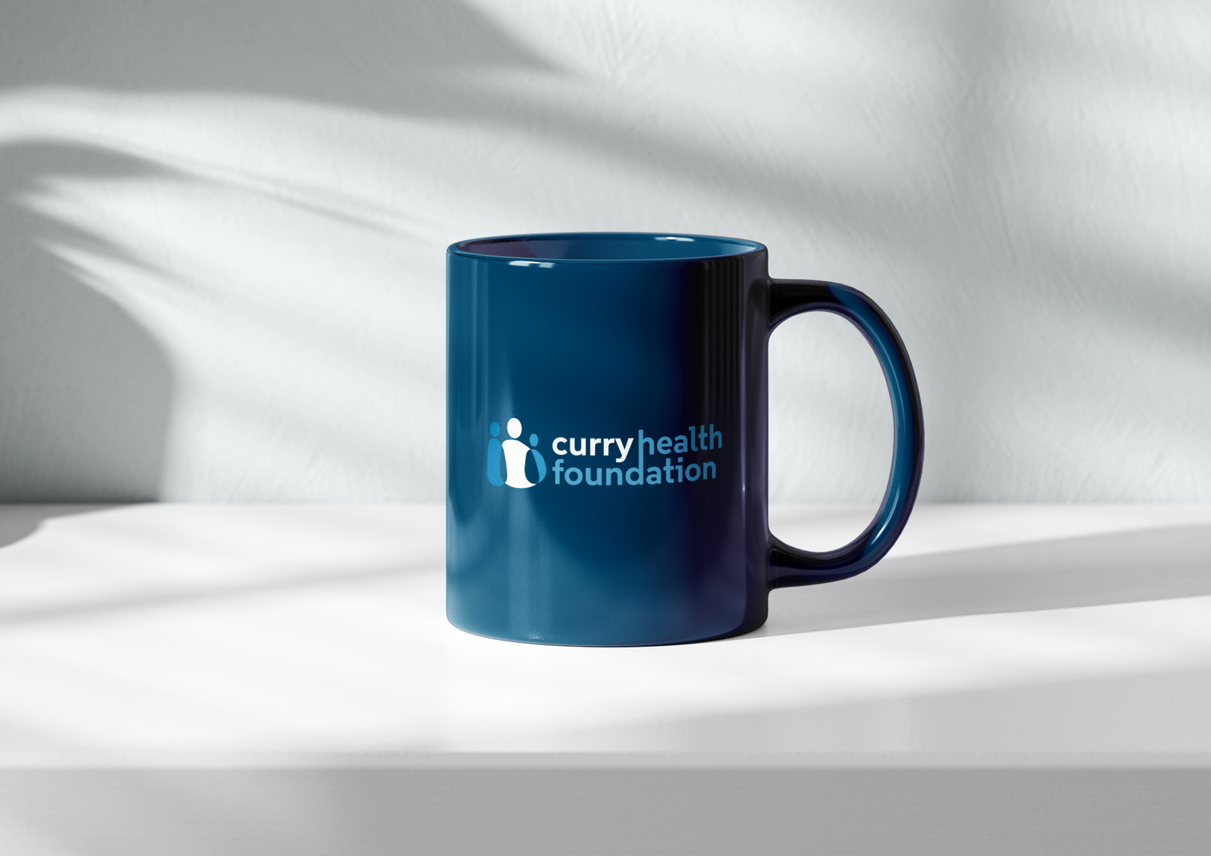
The Foundation plays a critical role in securing vital grant funding for other health-related non-profits, emphasizing the necessity for a clean and crisp visual identity. By incorporating shades of blue, the design will evoke trust and professionalism while accentuating the vibrant hues associated with community programs. This strategic approach ensures that the Foundation's impact is communicated effectively, fostering engagement and support from key stakeholders.